Good “Congrats!” ads aren’t easy to design.
You can tell a lot about an organization by the single-use ads they create.
These are used for many purposes – professional announcements for new hires or offices. Or when they want to share some self-congratulatory news or award the media won’t write about.
A popular variation of this is congratulating a high-profile client who’s received an award. 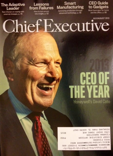
The July issue of Chief Executive magazine shows a range of ads from companies who want to publicly congratulate Honeywell’s CEO David Cote for his selection as the publication’s CEO of the Year. (If you’re a personal friend, you call or send a note. If you want to show everyone that your company knows the honored person, then you take out a full-page ad…).
Here’s a quick analysis of the types of one-time-only congratulations ads featured in the magazine, plus my overall score:
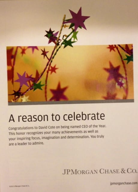
JPMorgan Chase followed the “Meaningless Clip Art” style favored by low-level designers without strategic advertising expertise. The generic, ambiguous headline offers no real information to the reader and isn’t intriguing enough to cause people to read the smaller text below it. Further, the clip-art graphic isn’t unique or interesting enough to cause anyone to want to learn what the “reason to celebrate” is.
The language is the obsequious kiss-up phrasing interns and low-level marketers think they’re supposed to use. Be careful when flattering influential people, it’s easy to look weak and sycophantic. Cheap artwork, safe text, and a basic layout that’s easy to produce by low-level in-house designers. They wasted extra money buying the inside cover, although they’d have been better off using it to hire a professional copywriter or ad agency. Score 4.0/10.
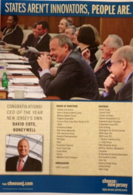
New Jersey’s cluttered ad is the “Designed by Marketing Committee” variation. It starts at the very top with a confusing headline (“States aren’t innovators?” Huh?).
It has too many conflicting design elements with too many things to look at, and in no particular order. Your eyes don’t know where to go or in what order; they just bounce around the page struggling for a focal point. It features the two telltale signs of an inexperienced committee: (1) small-type alphabetical lists of information no one will ever read, and (2) no white space to give your eyes a break.
The point of the ad, the actual “Congratulations!” is squished down near the bottom corner. Of course, since they spent all that money buying an ad, they might as well also list their entire 17-member Board of Directors, and every one of their 19 “Partners,” whatever that means.
These types of ads are what happens when “Susie knows how to use the design software” but doesn’t have professional-level design experience. This looks exactly like most government-sponsored ads. Score 3.0/10.
RHR International’s ad is a good example of the “We don’t have a brand” variation that is assuredly developed in-house. No style or elegance, it looks cheap, like it was created in Word or PowerPoint. However, it effectively conveys the necessary information without slavering or slobbering all over Mr. Cote.
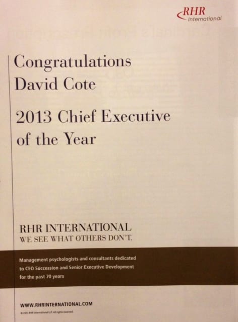
There’s a little “what we do” language in the brown bar, but not so much that it becomes an ad about themselves rather than the honoree. It’s ugly and boring, but not overwhelmingly negative. Score 5.0/10.
Microsoft Dynamic’s ad is the “Connect it to our Campaign” style. I initially thought it was simply a slightly more creative version of the RHR ad, with a straightforward headline, and graphic that uses his headshot in a relatively unique sort of way with the modified “Hello, My Name is…” sticker. On the back cover you later see MD’s other ad, and learn that the “Hello, My Name is” design actually supports MD’s larger ad campaign.
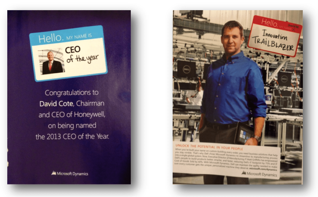
This shows a more skilled use of the brand visuals and message, without spending too much extra on this one-off version. They probably had their ad agency come up with this for them, who then sent it to a low-level but professional copywriter. Score: 7.0/10
The clear winner was UPS, with its “Creative, Professional, and Effective” ad. It leverages UPS’s well known brown color and national “Logistics” marketing campaign. They didn’t simply use the PR Department headshot, but rather shot a warmer, and more compelling, full-page photo.
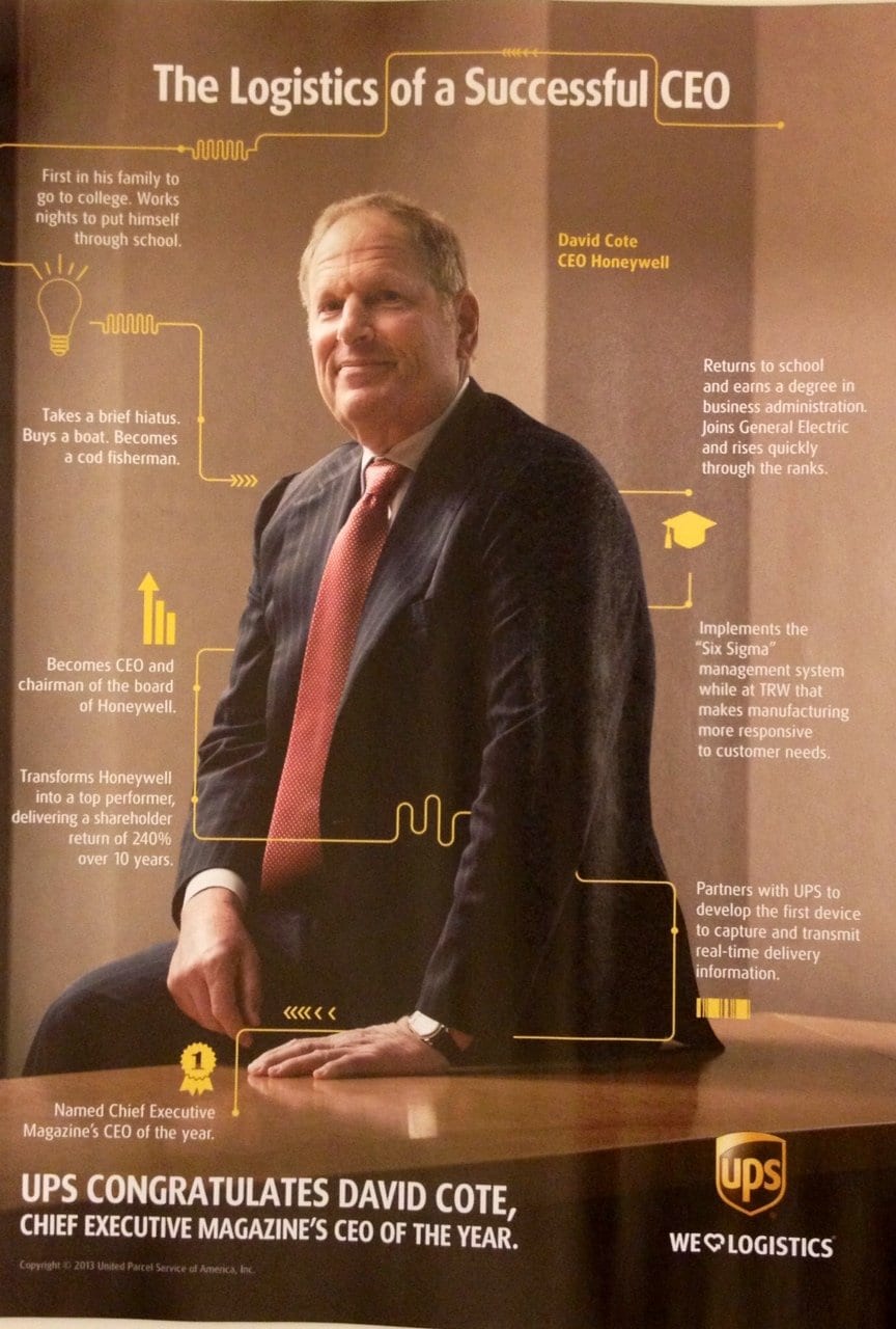
Their orange lines and icons remind us that it’s UPS, but they’re used like a timeline to inform the reader about Cote’s interesting resume and personal story. They use their brand to tell his story, but in a fun and effective way. It’s a full-page UPS ad, but it doesn’t fall into the sycophant trap or look like they’re insecurely or disingenuously trading on his reputation to prop up their own.
This shows high-level design and creative work by a skilled, professional agency. A home run. Score: 10/10.

