Litigation Counsel of America (LCA) “Proven Trial Lawyers”
The Litigation Counsel of America (LCA) is an invitation-only trial lawyer honorary society established to reflect the new face of the American bar. Membership is limited to 3,500 Fellows, representing less than one-half of one percent of American lawyers.
The composition of the LCA is aggressively diverse, with recognition of excellence among American litigation and trial counsel across all segments of the bar. The LCA offers its member great opportunities for education, professional development, networking, and referrals.

Ross Fishman speaks twice a year at the LCA educational conferences, on cutting-edge litigation-marketing topics, including e.g. LinkedIn and social media, online marketing, websites trends, and CLE and Ethics.
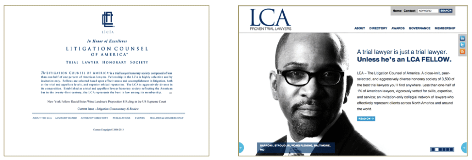
A group this prestigious deserves highly credible marketing, and it was time for a makeover. Its original website was intentionally sparse and understated, but website design had changed and LCA needed a dramatic new look to reflect its legal industry leadership.
Founded by Steve Henry, a big-firm litigator, the LCA Fellow were of the absolute highest caliber, and the conferences were extremely educational and at outstanding locations. The true value, of course, was the networking among the lawyers that helped develop close friendships and created countless co-counsel opportunities and referrals.
There are many self-proclaimed honorary associations, ranging from simple vanity directories like Who’s Who to groups with integrity and rigorous vetting processes like LCA. The challenge for the credible groups is to ensure that the invitees understand that an invitation to join is a true honor. In an era where top lawyers receive too many hollow invitations, LCA couldn’t risk potentially being lumped in with the bogus groups that are really interested in selling crystal trophies and wall plaques.
A cutting-edge website would help make the case. We determined to build it around dramatic, heavily shadowed black-and-white photos of the members, to showcase LCA’s outstanding lawyers and diverse membership. It’s a robust and user-friendly site, built with the powerful WordPress content-management system. It offers all the functionality a national organization would need, including mobile-ready, membership database, sign-up forms, conference information, and social media connectivity.
Before and after versions of the website:
In addition, LCA’s previous logo was trying to accomplish too many different tasks, which made it difficult to read. It included an interlocking set of initials, the association’s full name, a descriptor (“Trial Lawyer Honorary Society”), and tag line (“In Honor of Excellence”).
That’s an awful lot of information for a logo, which meant that most design elements had been reduced in size. We therefore stripped it down to the most important elements and enhanced its visual appeal and readability. We redesigned it to simply “LCA,” the three bold initials. This reflected how everyone already referred to it — “Litigation Counsel of America” was simply too long to use regularly.
But initials have no independent meaning, so we chose a short tag line – “Proven Trial Lawyers.” This clearly informed viewers what this “LCA” group was. “Trial Lawyer Honorary Society” was nicely descriptive, but it was just too long to use in a simple logo without shrinking it to the point of illegibility.
Before and after versions of the logo:


