Lugenbuhl
Lugenbuhl, Wheaton, Peck, Rankin & Hubbard is an unusual and important firm with offices in New Orleans, Baton Rouge, and Houston — not a traditional full-service firm, but a collection of leading niche practices, some of which are interestingly integrated.
Their primary practice areas are Maritime/Admiralty, Energy, Litigation, Bankruptcy, and Insurance Coverage. We worked closely with Rodger Wheaton, the firm’s dynamic managing partner.
They sell efficiency, not frills or unnecessary extras. Lugenbuhl lawyers are serious lawyers accomplishing serious tasks efficiently, because that’s what clients want. Clients want to be OUT of the lawsuit, so they can make money and not sit in depositions or trials. They’re always in the market for creative approaches for prompt resolution. That’s what this firm offers.
After seeing Ross Fishman present in Philadelphia, Istanbul, and Brazil at Lawyers Associated Worldwide (LAW) conferences, Rodger hired Ross to present a series of marketing and CLE programs at a Lugenbuhl firm retreat. After the retreat,
We saw that they were tough, confident lawyers, as well as interesting, friendly people. The marketing platform focused on the lawyers’ intellectual rigor and toughness that their clients say they value. But also on how knowledgeable and experienced they are regarding the local judges and courthouses.
The logo was the first challenge. The late Mr. Lugenbuhl had been one of New Orleans’s most prominent lawyers. The latter four lawyers were the firm’s dynamic leaders.
Changing a logo to emphasize fewer of the lawyers is always a challenge, as certain lawyers must agree to enlarge other names for marketing purposes.
This can be a deal-breaker for some lawyers. Here, the four other lawyers acknowledged that “Lugenbuhl” was a strong, powerful, challenging, but memorable name, and could be useful in building the firm’s visibility. It was also the firm’s current street name – no one’s wondering which “Lugenbuhl” firm you mean. Combined with the firm’s strong personality, this led to the tag line “Tough Name. Tough Lawyers.”
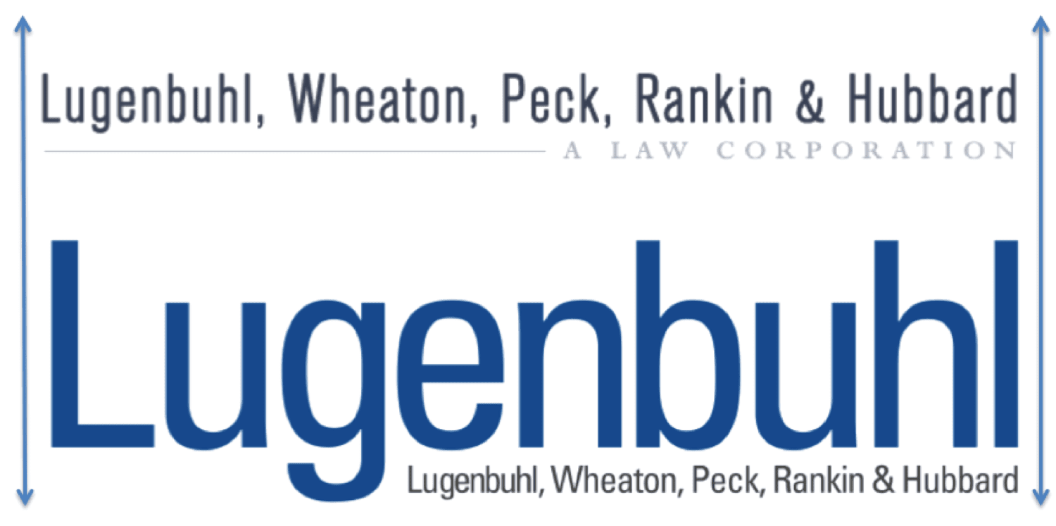
We redesigned the firm logo to focus on the strong, unique name “Lugenbuhl.” The firm retained all four names, but the logo emphasized “Lugenbuhl,” which is the appropriate solution in this case. By focusing on the first name, it allowed our talented designers to enlarge that name. Below, you can see how much stronger the “after” version is, how much more it stands out when they are used at the same width.
Here is the before and after of the logo, shown at the same width:
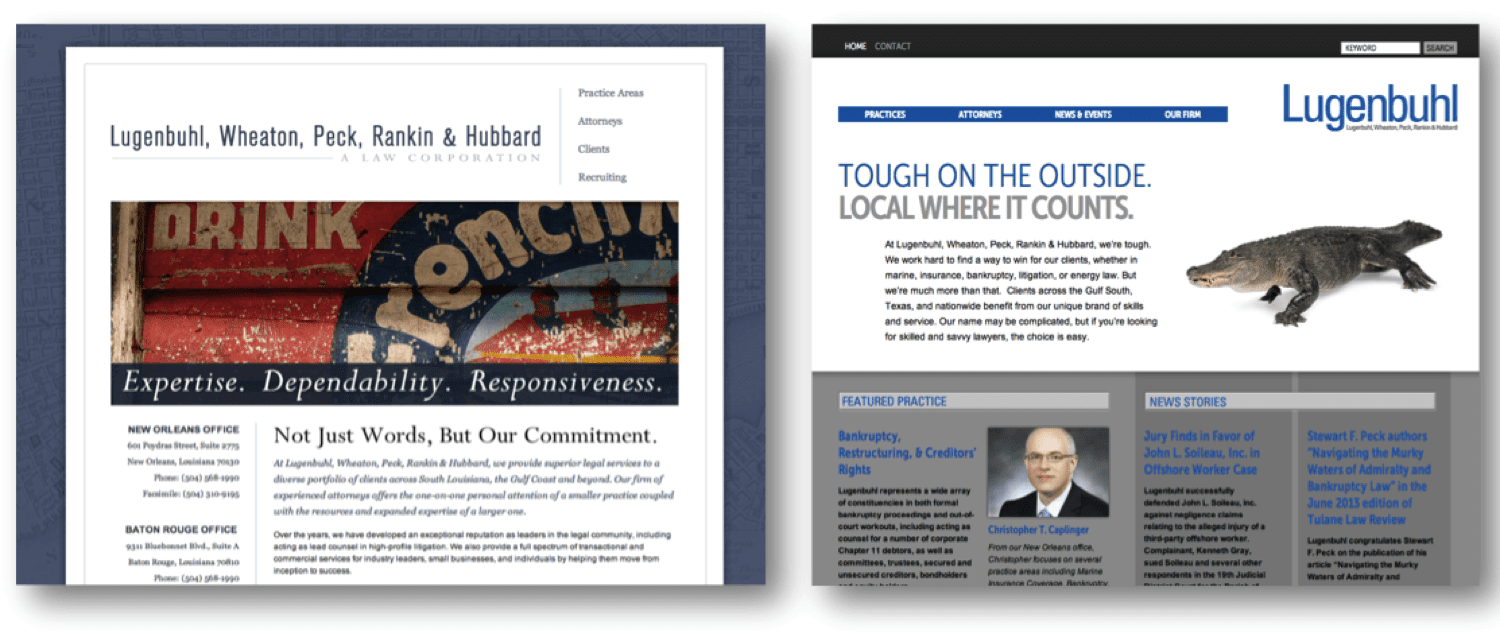
More important than the logo, the marketing platform needed to show that these were strong lawyers who were still friendly and nice to work with in both Louisiana and Texas. Their current website was getting dated, and used artistic images that did not showcase their unique style, along with a truthful but bland “Expertise. Dependability. Responsiveness.” tag line. They were all of these nouns, but so were many of their top competitors.
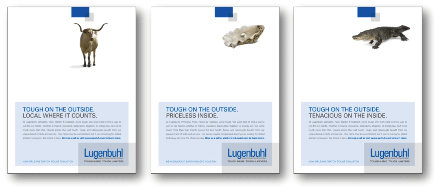
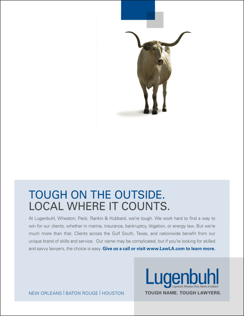
We wanted to develop a visual theme that told their “tough but nice” story. We needed this to work in Louisiana and Texas, as well as a version that supported their regional-leading Marine practice. We’d identified three things that had rough exteriors and related to the geographic or practice areas, a long horn steer, oyster, and alligator.

