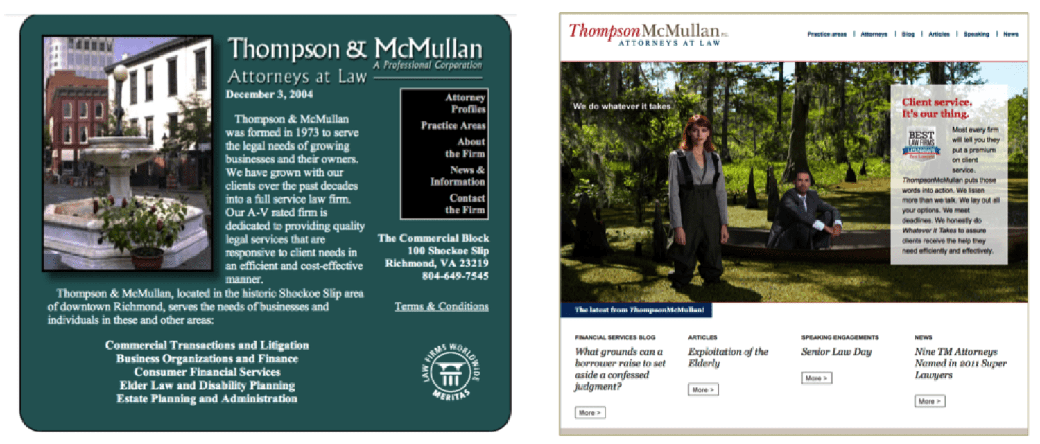
This marketing campaign and website showcase Thompson McMullan’s dedication to going the extra mile to get the job done for sophisticated corporate clients.
Objective
1. Increase the visibility and name recognition of a mid-sized Richmond, VA business law firm, and
2. Showcase its skills as a dynamic, creative, service-oriented law firm representing middle-market and larger businesses across Virginia.
Background
In Virginia, mid-sized firms tend to represent local, middle-market companies. Those firms are perceived as having less-sophisticated, less-specialized legal skills. They may be good for the average bread-and-butter work, but not the more complex transactions, or the larger litigation cases.
ThompsonMcMullan is different, both in terms of culture and technical skills. They are doing extremely sophisticated work, the same caliber work as the big firms, but in a smaller, more manageable environment, and are much more client-service oriented. They needed a message to show how they do things differently, and go the extra mile to serve their clients’ needs.
We wanted to convey that these lawyers can handle the complex real estate deals, the large business transactions, the complicated tax and estate plans for the ultra-rich, and tough litigation — and they do it with remarkable personal service.
They have fewer layers of lawyers, smaller dedicated client teams, more top-level partner involvement, and more efficiency.
We started with a series of marketing-training programs. Ross discussed the firm’s client-service history, and taught the lawyers to focus their individual marketing efforts on narrower targets and industries.
Working closely with Amy Smith, one of the legal profession’s top marketing directors, we developed a tightly integrated marketing campaign which included print ads, website, tag line, brochures, and public relations.
Website before and after:
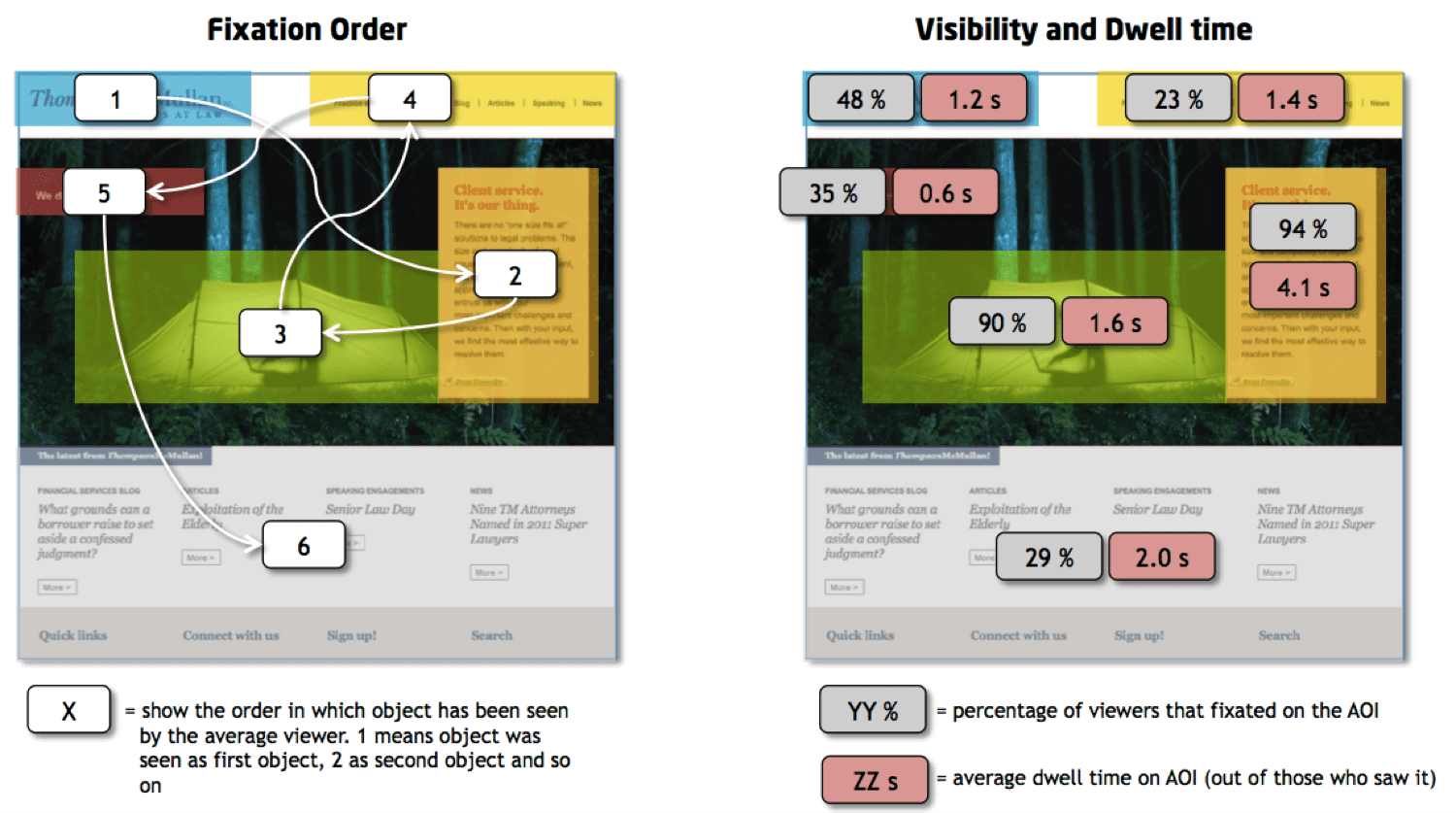
Eye-tracking research
Before launching the website, we used sophisticated eye-tracking research that had never been used before to analyze and improve a US law firm website. We wanted to ensure that the design conveyed our message most effectively, and that the viewer experience met our strategic goals. We analyzed what particular areas the viewers saw, and in what order (Fixation Order), and how long they spent on each area.
We learned that our design effectively conveyed our message, that they read the headlines and the supporting text, as well as our logo. We further discovered that this layout did not cause as much visual fixation upon the tag line which summarized our message, so strengthened its typeface to stand out more.
The marketing campaign and refreshed website positioned the firm as a leader in its market, and helped generate significant additional revenue.


