OBJECTIVE:
Design a new brand and website for a leading full-service Ohio-based regional law firm.
BACKGROUND:
Roetzel & Andress is a 150-lawyer full-service law firm with a growing Midwest footprint. They’re extremely skilled lawyers, representing some of the region’s top companies, and boast an exceptionally strong litigation practice. They wanted to break into the Chicago market while maintaining a leadership position at home in Akron.
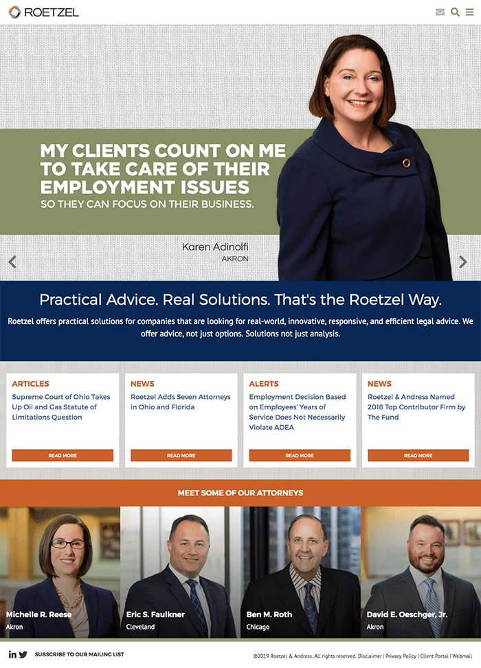
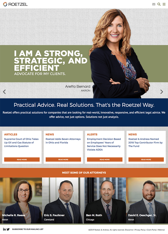
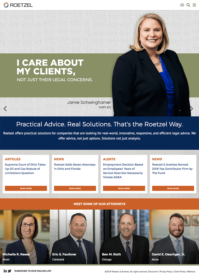
WordPress Website Features
- Integrated marketing campaigns
- Custom responsive design for Mobile/Tablets
- Rotating slideshow with headlines
- Expandable Menu feature for Practice Areas and Industry sections
- Searchable Attorney Database by Practice Area, Name and Keyword
- Enhanced Attorney Profiles and Practice areas that dynamically load in features such as related news, speaking engagements and related practices.
- Advanced Print to PDF features
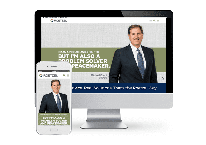
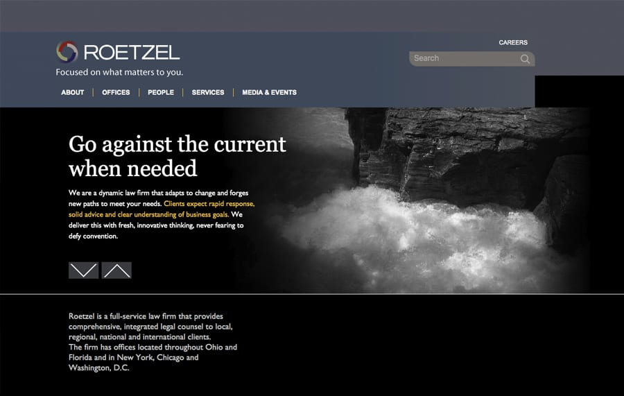
BEFORE AND AFTER
CASE STUDY
Big firms are renowned for their long, esoteric legal memos that detail a client’s many theoretically available options but don’t offer the client any actual help. Roetzel lawyers pride themselves on offering practical solutions for today’s busy companies. They’re a larger firm with small-firm values. Roetzel has the people, experience, and sophistication to handle any public company or closely held client needs, making them a good choice for companies that want real-world, contextual, expert legal advice at a fair price.
Roetzel lawyers are creative, practical problem solvers. That’s the positive message we wanted to convey about the firm. The firm has a long track record of bringing all types of resources together to solve client problems in unique and innovative ways. They see the big picture within the client’s real-world business context.
Roetzel lawyers are trained to take a step back and ask clients, “What are you trying to accomplish? What is the REAL problem you’re trying to solve? We’ll get you where you want to go [whether it’s doing a deal or resolving a dispute.] We’ll get that done. This became very clear in the in-person intake interviews, where the partners were proud of their practical approach, offering real-world advice, not options; Solutions, not just analysis. We featured this in the tag line “Practical Advice. Real Solutions.” This was supported by the secondary tag line “That’s the Roetzel Way.”
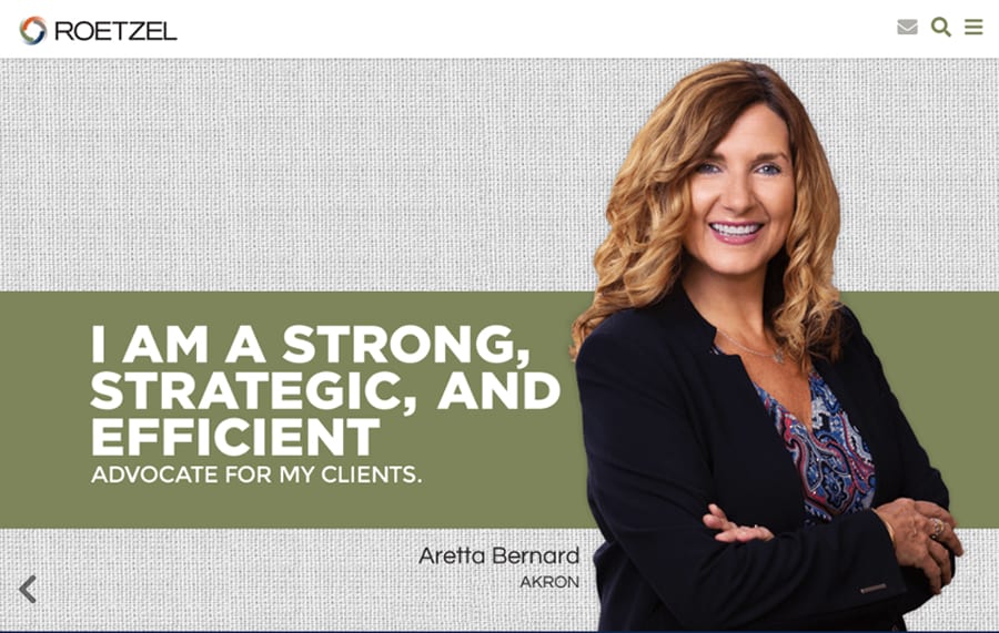
They were so passionate and eloquent in their descriptions, we built the branding visuals and website around their actual quotes.
STYLE:
We need to look a little flashier, to cut through the clutter, and shake up the market. Their market reputation was more conservative than the firm’s reality, so we wanted to be a bit bolder, a bit more colorful, to cause people to rethink their view of the firm. They had an especially colorful logo, so we picked up that palette in the materials.
