
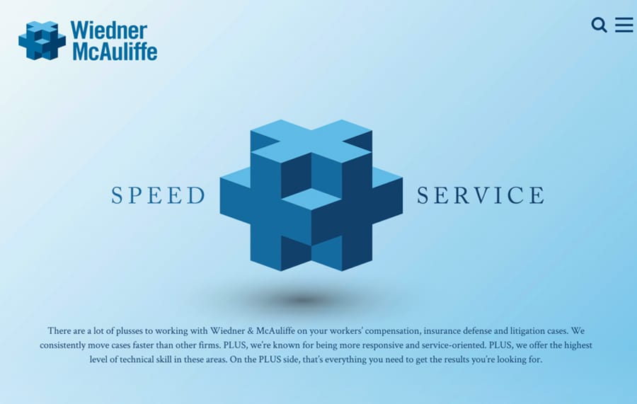
Objective:
Build a brand and website for the Midwest’s largest worker’s compensation firm.
Background:
Wiedner & McAuliffe is one of the nation’s leading worker’s compensation firm, also boasting a strong insurance-litigation practice.
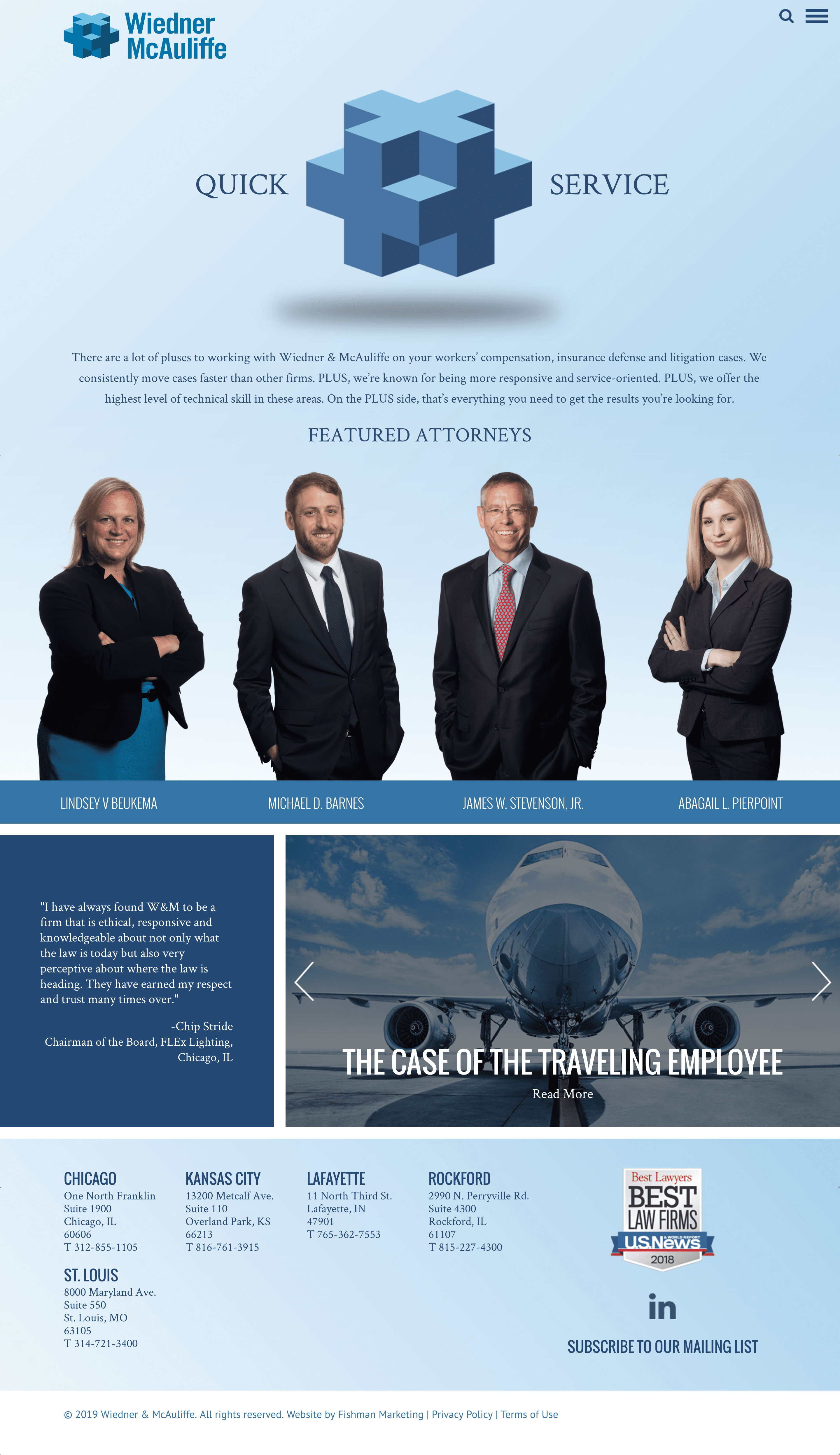
WordPress Website Features
- Integrated marketing campaigns
- Custom responsive design for Mobile/Tablets
- Fishman Marketing’s Legal Platform
- Dynamic testimonials and featured case studies
- Logo animation on home page
- Rotation of Featured Attorneys
- Print to PDF feature
- Advanced Searchable Attorney Database
- Enhanced Attorney Profiles and Practice areas that dynamically load in features such as related news, speaking engagements and related practices.
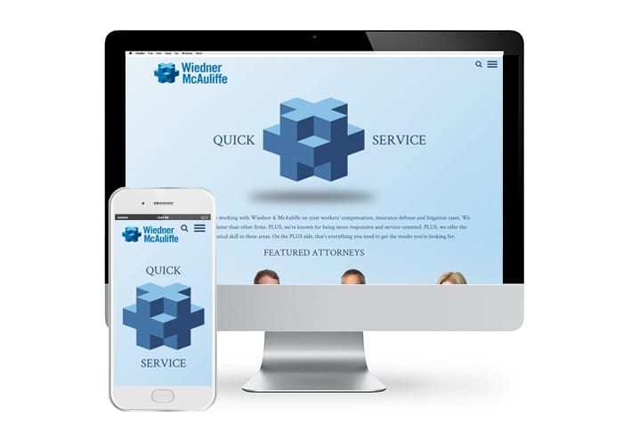
BEFORE AND AFTER
CASE STUDY
Worker’s compensation cases move faster because there is very little formal discovery. To keep the clients happy and make money, firms need to push cases along quickly and strategically. Fortune 500 companies may have tens or hundreds of thousands of employees, many of whom will get injured while at work.
In worker’s compensation, the name of the game is speed. The insurance companies want their law firms to move the files through the pipeline. Unlike traditional business litigation that might take 3-5 years to resolve, insurance companies want to move worker’s compensation cases very quickly.
Wiedner & McAuliffe lawyers (1) move cases to resolution faster than other worker’s compensation law firms and (2) are statistically more responsive and service oriented. The firm has pioneered sophisticated measurement tools, enabling them to carefully track a wide range of important case-management metrics to continue improving performance. The WM mantra is “Close one file, two more come in.” Clients love how fast they move their files, and routinely reward the firm with more work. The firm has grown very quickly as a result.
BRANDING


Wiedner & McAuliffe lawyers are fast, skilled, and service oriented. Every firm says they’re great, but Wiedner & McAuliffe has the hard data to prove it.
The firm’s message is speed plus service.
The tag line:
“Everything you want in a firm, plus.”
We built the design around a 3D plus sign, suggesting that clients get more at Wiedner & McAuliffe. Their old logo had distractingly large “WM” initials that overshadowed the firm’s name. We built a stylized 3D plus sign directly into the bold new logo.

