Redesigning a logo with fewer names can be difficult.
Below are two logos – before and after the redesign, obviously. Note, they’re exactly the same width.
Which one stands out? Which one are you more likely to notice and remember?
It’s obviously the right decision, there is no scenario where the top version is a “better” or more effective logo than the new one below it. There are too many equal-sized names, and your brain can’t process all that visually similar information. There’s no focal point, so your eyes don’t know where to go.
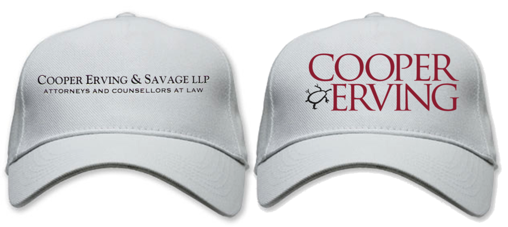
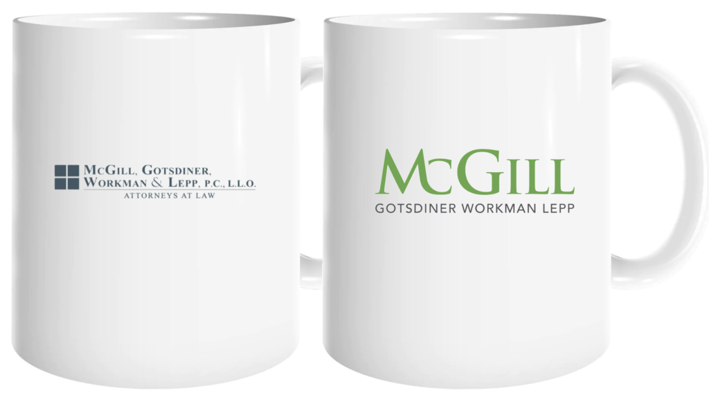
If you put it on tchotchkes like a hat or mug (see various before-and-after mock-ups below), or used it on business cards (also below) or a website, there’s a clear contrast. If you looked away, you wouldn’t remember the firm’s name.
The bottom version with the larger name obviously helps the reader remember the firm’s name.
And that’s what a good logo is supposed to do. It tells you what to remember, how to find them. You know what to call them. Which of course is the whole point – it’s a strong, interesting, unusual, and memorable name. It’s what The Street has always chosen to call them – either “Lugenbuhl” or “The Lugenbuhl Firm.” But changing a logo to reflect that reality is still extremely difficult.
During these projects, I take a confidential one-on-one survey of a cross-section of the firm, asking them “What do people call you?” Everyone knows what the firm’s Street Name is. And it’s NEVER more than two names long. (Except perhaps Frost Brown Todd.) The question usually comes down to whether it’s just the first name or the first two names. But deep down, everyone knows, including the firm’s founders.
During the conversation about the issue, it’s vital to publicly reinforce that we’re only changing the logo, not the firm name. We’d never recommend changing the firm’s official, formal name (that’d be consulting suicide). There’s rarely a good reason to do that–it’d require a ton of paperwork, contentious partnership votes, and likely insurmountable resistance by the name partners.
That’s a critical point to repeatedly reinforce. It’s just the logo; we’re simply creating a more attractive picture of your firm name, in keeping with today’s design standards for law firms. Look at your competitors; 90% of them have already done that, except for the smallest firms.
Nonetheless, executing it successfully requires teamwork. Commitment to the firm. Trust. Strong leadership.
Here, Messrs. Wheaton, Peck, Rankin, and Hubbard are all still practicing. They’re dynamic lawyers with great practices, leaders in their various industries (marine, bankruptcy, environmental, and energy). The latter Name Partners must have the professional security, integrity, and confidence to allow their names to be reduced in size compared to the first lawyer’s.
They have to suppress their egos for the sake of The Firm. They must understand and accept that enlarging the first name over the others isn’t a comparative value judgment. And you can help the name partners understand that by showing these types of juxtaposed examples. It’s hard to argue with the logic once everyone’s seen the evidence.
The redesign doesn’t suggest that Mr. Lugenbuhl is “better” than they are.
No one thinks that this type of rebrand implies that the larger name(s) are smarter, more important, more valuable, or better looking than the smaller one(s). It’s just that his name was first on the door and that having too many names of equal visual weight simply makes no sense from a design or functionality perspective.
It makes it harder to grasp visually and remember later, which hurts everyone’s business development. The only possible explanation for keeping a design like this is the ego and insecurity of the latter-named lawyers.
Of course, ego is not an insignificant thing, especially in a professional services firm.
In a law firm, having your name on the door is the brass ring. No one screws with a lawyer whose name is prominent on the letterhead. Candidly, in their position, I wouldn’t want my name shrunk or eliminated from the logo either. Regardless, it IS, of course, the right thing to do.

And that’s how we always pitch it: “It’s not about Mr. Lugenbuhl!” “Lugenbuhl” simply becomes a word, a noun, the company name. It’s no longer about the person, it’s just a word that represents the firm. People don’t wonder who “Mr. McDonald” is when they buy a hamburger, or call and ask to speak to Mr. Skadden.
That’s certainly a challenge in first-generation law firms when one or more of the names on the door are still practicing. This is particularly true when the firm has gradually added the firm’s top billers or rising stars to the end of the name. The people in the front may no longer be as powerful or relevant as the latter names. But it’s still the right thing to do.
Good for S. Rodger Wheaton, Stewart F. Peck, S. Frazer Rankin, and Ralph S. Hubbard, III. They did the right thing for the firm. I sincerely respect their strategic sacrifice.
Here are two business card options with similar layouts. The point is pretty obvious, don’t you think?
This is equally true following a merger.
There’s often loyalty to their old firm’s name, which is entirely understandable. Neither firm wants to feel they’re losing their identity, proud history, or hard-earned reputation. But combing the firms’ names, is rarely the best long-term solution — it creates the type of too-long name we’re trying to avoid. Inevitably, the larger firm gets the first slot(s), followed by the smaller firm, which has its name reduced after a two-year run-out.
But it’s important to have an aggressive transitionary rebranding period to ensure that the smaller firm has its brand identity migrated firmly to the new firm. You never want the smaller firm’s contacts wondering, “Hey, whatever happened to Smith & Jones?”
————————-
Need a new brand or logo for your own firm?
Contact Ross now at: ross [at] fishmanmarketing.com or +1.847.921.7677.
Download a free copy of his best-selling strategy and branding book, “We’re Smart. We’re Old. And We’re the Best at Everything.” here or buy an actual book on Amazon here.
Do your lawyers need marketing training or a dynamic speaker at a firm retreat, either live or via webinar? Ross is one of the legal profession’s most-popular marketing and CLE presenters. Here’s a link to a video of Ross in action.

