Hedrick Gardner
Hedrick Gardner is one of North Carolina’s top litigation firms — 100 lawyers with hard-core trial skills. They resolve their clients’ business, worker’s comp, and insurance disputes efficiently, but are quite happy to pick a jury when the case or situation merits it.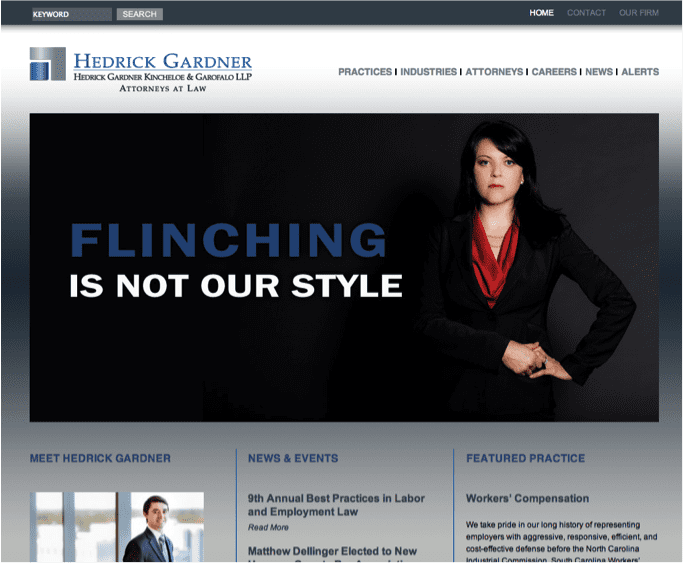
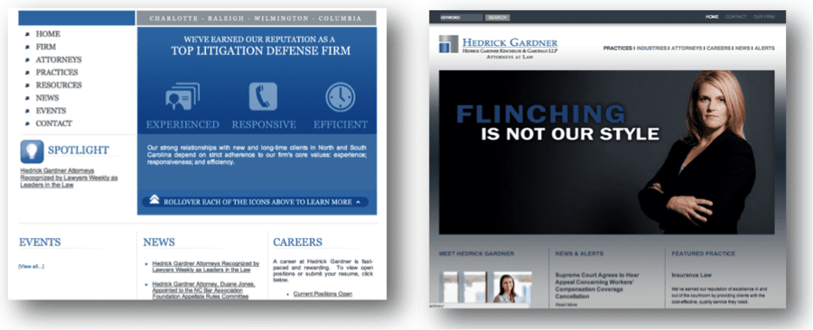
The firm was looking to diversify their practice, to add more high-dollar business litigation. Although eminently qualified to handle these cases, their predominant insurance defense and workers compensation practice had made lateral recruiting challenging. Their tired old website (see below) created an image of a low-dollar insurance firm rather than a top litigation boutique. Their recruiting efforts had not been effective.
We needed to rebrand the firm, both inside and out. We needed to persuade the marketplace that Hedrick Gardner as outstanding trial lawyers. Their insurance and comp history was actually beneficial – it meant the lawyers knew how to work efficiently and effectively. And they could expertly try all types of big, tough, complex cases.
We needed the lawyers to think differently about themselves as well. We wanted them to realize they weren’t just lawyers who worked for insurance companies, they were outstanding trial lawyers who just happened to work frequently in the insurance and WC areas. It was just as accurate a message, just repositioned.
We started with a firm retreat.
Ross Fishman educated the lawyers about branding and differentiation, helping reinforce the extraordinary skills and value the Hedrick Gardner lawyers offer to their clients. He taught them how to sell high-dollar business litigation to purchasers who had previously considered them to be workers comp lawyers.
Many commercial litigators don’t like to go to trial; deep down, they’re more likely to settle on the courthouse steps to avoid picking a jury. Hedrick Gardner’s willingness to take a case to trial gives their clients a big advantage. This led to the “We Don’t Blink” tag line, and a variety of analogous headlines, like “We never back down from a fight.”
We worked closely on the messaging with their outstanding Executive Director Erik Slattum and Marketing Partner Jeff Kadis. With high-end art photography and challenging headlines, the marketing campaign shows that the Hedrick Gardner lawyers are strong, skilled, and confident. Marketing Communications Coordinator Alyson Willis, and Marketing Event Coordinator Sara Snavely supervised the chosen photographer to ensure the lawyers’ expressions walked a fine line – powerful, but not jerks. Fearless, but not mean.
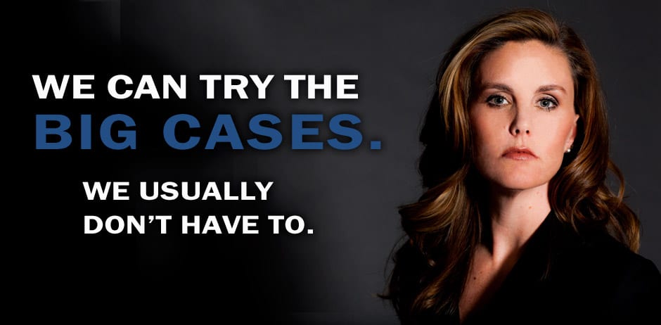
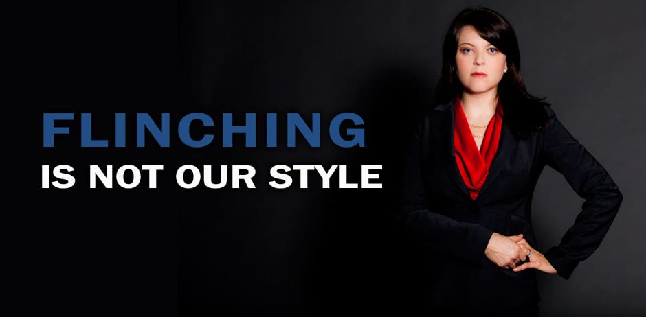
The home page rotates through photos of 15 different lawyers with a range of tough messages, focused on trial skills and experience.
Market research.
Clients say that a great website won’t be the exclusive, decisive factor in hiring a law firm for a significant piece of legal business. However, in the next breath, they readily admit that a bad website can immediately knock a firm out of contention, i.e. “I can’t show your ugly website to my boss; if we lose the case, you don’t offer me enough CYA protection.”
We conducted market research to compare the perceived quality of the firms represented by the two home pages, rating them on a 1-10 scale, with 1 being “terrible” and 10 being “highest quality.” The “before” home page averaged a 3.5/10, barely a C-. The “after” home page received a 7.75/10, perhaps an A-.
That is, changing the website doubled the perceived quality of the firm.
Before and after versions of the website:
Results:
Within six months, the firm had hired four leading business litigators, far exceeding their goals.
The campaign shows the lawyers’ toughness, but we also wanted to show the firm’s warm, friendly culture, so we ensured that the lawyers were smiling in their biography photos. Below are some home page banners and associated lawyer head shots.

