Is your Website a 24/7 Cheap Suit?
A lawyer I know is obsessive about his appearance.
He wears $2,000 Italian suits, starched white shirts with French cuffs, and has a personal shoe-shine guy come to his office every few days. He drives a highly polished 7-series Mercedes he’ll only park indoors, and he hired a renowned interior decorator to ensure his office is perfectly appointed. His mahogany desk could have small planets orbiting around it.
He clearly understands the power of appearing successful.
After meeting him, I looked him up online and found a seven-year-old, poorly designed, template website, with stock photos of columns, handshakes, and other typical marketing cliches.
Seriously, guys, it’s not that complicated. Your website is available 24/7/365. It’s the first place people will go after meeting you. It’s how many of them will form or reinforce their impression regarding the quality of your practice. They routinely admit that a bad website can remove a law firm from consideration.
If you wouldn’t wear a leisure suit or sit on beat-up furniture, consider — are you still using a “flea market” website?
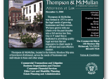
Here’s the website of ThompsonMcMullan – one of Richmond, Virginia’s top law firms. Outstanding lawyers with an incredible client-service orientation. Their clients say they go the extra mile every time — trust me, I talked to a bunch of them. They’re Richmond’s Meritas firm, so you know they’ve been thoroughly vetted, inside and out. The Marketing Director, Amy Smith, is one of LMA’s national leaders. I could go on, but you see where I’m going here.
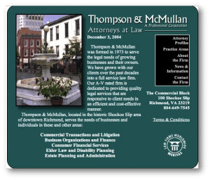
And when Amy called us to redo their branding and website, this green version is what their website looked like. It was probably terrific when it was launched, but design changes fast online, and firms must ensure that their website validates the high-quality skills prospects suspect that you have when visiting your site to double check.
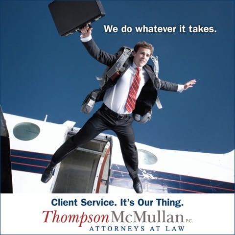
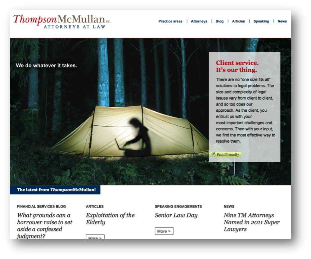
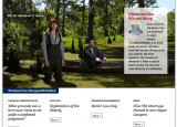
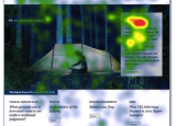
So we quickly identified outrageous client service as their brand message, designed an eye-catching visual platform supporting it, and developed a robust WordPress website that showcased all the good things about them. A firm this good deserves to look like it. Below shows the “After” version, along with other elements from the marketing campaign.
Now, with the branding materials supporting them, all of their lawyers’ marketing and business-development efforts work just that much better. And when everyone’s rainmaking improves, so does the bottom line.
Ahhh, doesn’t a new suit feel better? Of course it does.

