Fostering Good Marketing – Jones Foster.
Jones Foster Johnston & Stubbs is a high-quality, old-line West Palm Beach, Florida law firm — 35 great lawyers and a relatively conservative and wealthy target audience. As we discussed previously in our “Name-based marketing” post, it can be useful for marketing purposes if your firm has a fortuitous name.
Here, for example, there was a nice, positive verb in the title, “Foster,” which led to a client-oriented marketing and branding campaign. As a smaller firm, it had the typical challenge of inadequate visibility. Like most firms their size, they hadn’t historically invested in external, broadcast-oriented marketing activities. And, like many  Florida firms, much of their marketing dollars were spent on charitable contributions and sponsorships – the types of activities that didn’t really build the firm’s name recognition.
Those who knew the firm respected them, but not enough people within their target audience knew them.
We wanted to spend some effort expanding its reputation. We decided to create a marketing campaign that would establish the firm’s culture and leverage the firm’s fortuitous name, making it easier for their prospects to remember them.We began by redesigning the logo, to emphasize the firm’s colloquial “street” name, Jones Foster, and highlighting “Foster” in blue.
Before:
After:
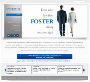
Then we developed the collateral materials around that, including print ads, a brochure, and the website, JonesFoster.com.
The name “Foster” gave us an easy opportunity to highlight certain aspects of their practice and approach, like the lawyers’ focus on trust, innovation, collaboration, and strong relationships.
Professional-services firms have a variety of branding challenges, including names that are hard to spell, pronounce, or remember. Therefore, when we can leverage a good name, we try to use it — it helps lock the campaign into the minds of the audience, both reinforcing the message and the name. Consider Best, Best, and Krieger, for example. Then contrast it with a more-challenging name like “Leboeuf.” Or my old firm “Ungaretti & Harris.” We knew many people couldn’t spell “Ungaretti” so in 1995 we opted for initials instead — uhlaw.com. (We declined to spend $35 to buy UH.com because “Uh” sounded unintelligent.)
Anyway, the Foster campaign lent itself to a clean design, e.g. in the new website (see the old version below):
… which also complemented the print ad campaign, designed with lots of white space:
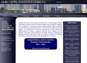
Old website:
The cluttered design and skyline imagery didn’t convey the quality of the firm’s practice. It just looked like every other firm around town. Nothing memorable. They deserved better.
 Florida firms, much of their marketing dollars were spent on charitable contributions and sponsorships – the types of activities that didn’t really build the firm’s name recognition.Those who knew the firm respected them, but not enough people within their target audience knew them.


