Rebranding an insurance law firm.
Galloway, Johnson, Tompkins, Burr & Smith is a 110-lawyer, 11-office New Orleans-based insurance-litigation firm. They’re one of the Gulf Coast’s leading insurance firms ― tough, skilled, service-oriented lawyers with great trial skills. They also handle sophisticated business litigation. That’s a common challenge for insurance-oriented firms — identifying a message that supports the dominant insurance practice while continuing to qualify them for higher-dollar commercial litigation.
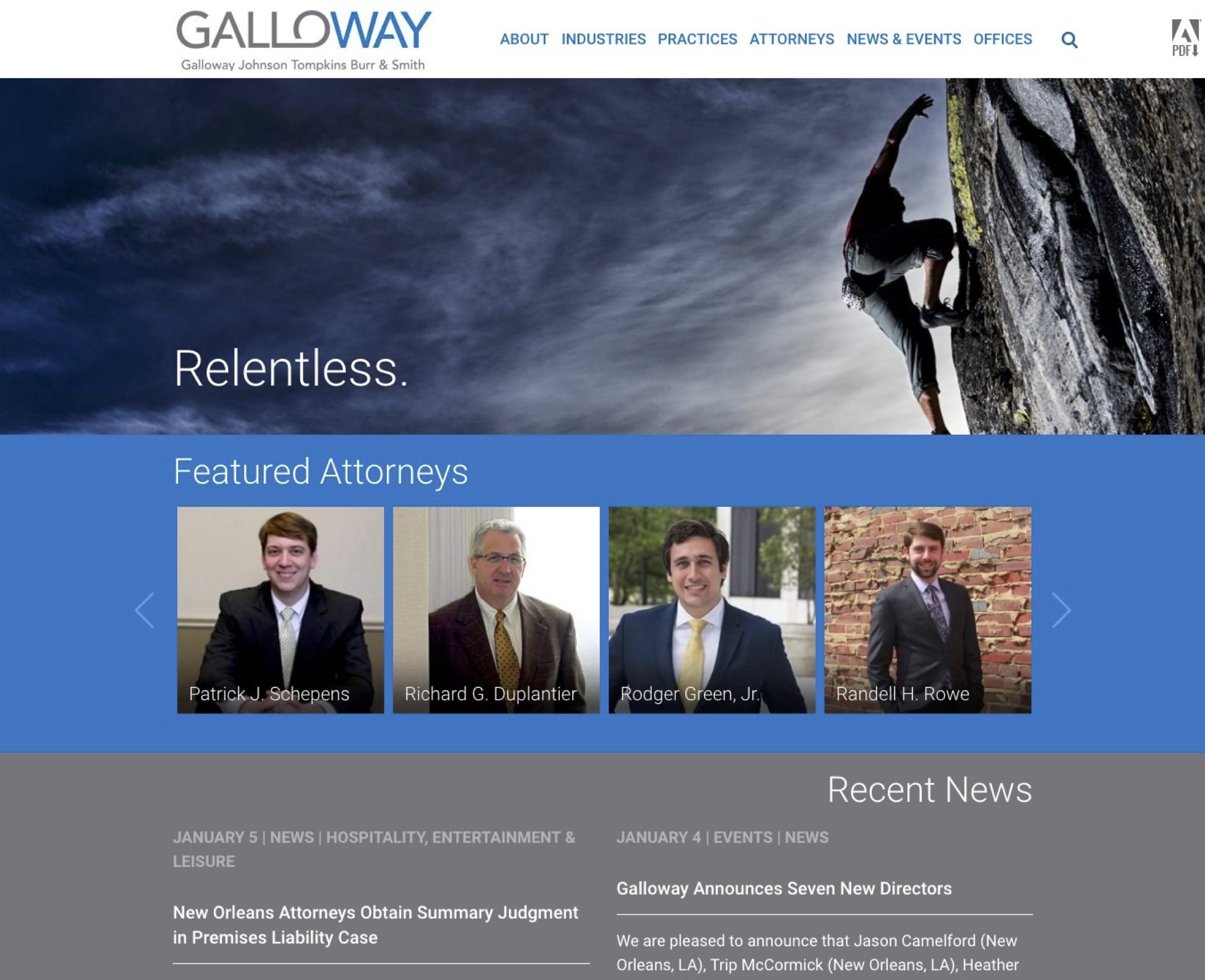
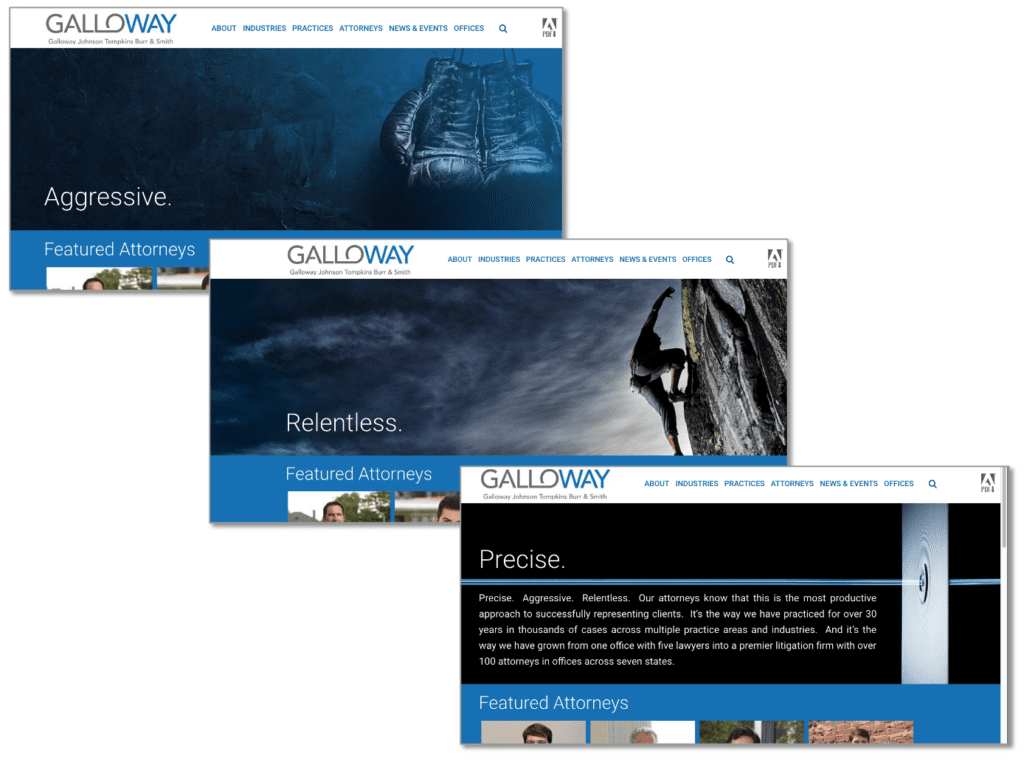
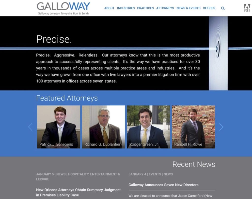
One strategy is to focus on how they practice, not what they do ― discuss their outstanding skills, not the particular industry they work in. The firm’s tagline emphasizes their approach. Galloway lawyers are “Precise, Aggressive, Relentless.” We selected bolder images that supported these specific concepts, eliminating the home page’s “Rooted in New Orleans” tree that limited the firm’s brand and geographic reach.
Galloway lawyers are smart, tough, no-nonsense brawlers — savvy litigators who know how to get clients what they need and want, and move large and small cases through the litigation pipeline efficiently and at a fair price. This new brand and website better reflects the nature of the firm and its lawyers. The updated WordPress website boasts a simple, clean design with all the latest bells and whistles, and the mobile site is powerful and easy to use.
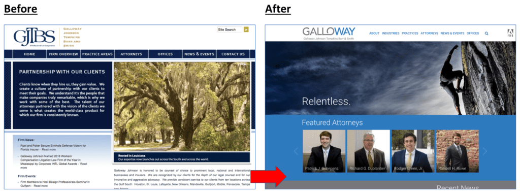
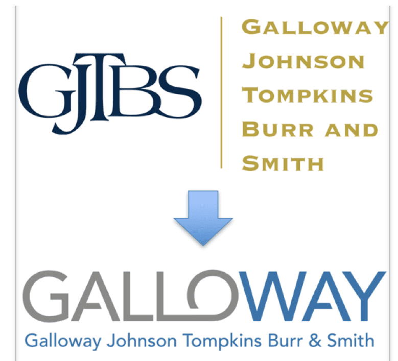
We strongly advocated redesigning their “GJTBS” logo from the Giant Initials style to one that emphasized its colloquial street name, “Galloway,” i.e. “He works at Galloway” or “She’s at the Galloway firm.” The firm’s fortuitous name had the positive word “WAY” within it, which we wanted to reinforce in the logo, to enable concepts like “That’s the Galloway.”
We feel that these distracting Giant Initials logos distract viewers from the most important information, the firm’s abbreviated street name. Obviously, the marketplace does not refer to the firm as “GJTBS,” so this type of design is rarely the best solution — they’re not DLA, PWC, or KMPG. The difference is obvious when you see both versions at the same width:
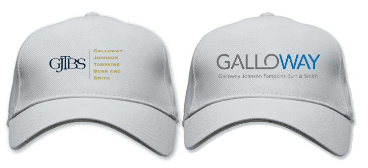
Look at the hats.
See how much better it works in actual use?
Take a few steps back from your computer. Which logo makes it easier to find the firm online later?
Don’t you want your lawyers to be considered “Aggressive, Relentless, and Precise”?
If so, you can’t show a photo of a skyline, empty conference room, or vague abstract shapes or colors on your home page.
You need more. Don’t you deserve something better? (If so, call Ross ASAP!)
Will you need a new brand, website, or training for your firm NEXT year?
Contact Ross now at: ross [at] fishmanmarketing.com or +1.847.921.7677.
Download a free PDF copy of his best-selling strategy and branding book, “We’re Smart. We’re Old. And We’re the Best at Everything.” here or buy a paperback on Amazon here.
Do your lawyers need marketing training or a dynamic speaker at a firm retreat, either live or via webinar? Ross is one of the legal profession’s most-popular marketing and ethics CLE presenters. Here’s a link to a video of Ross in action, and a list of 25 of today’s hottest law firm marketing training topics.

