How do you brand a region’s largest law firm?
We worked with Idaho’s largest law firm, Boise-based Hawley Troxell, an impressive and creative group of lawyers, the biggest firm in Idaho.
When you’re the biggest firm in town, you get to use that to your advantage, it’s a powerful differentiator in a bigger-means-better culture. It’s an attribute your competitors can’t claim or copy, and we wanted to ensure we’d locked in that position as regional firms began moving into town.
Predictably, their smaller competitors’ messaging had sought to position their firms as faster and more nimble. Obviously, if you’re not the biggest firm, a legitimate counter-strategy is to use their size against them, for example claiming that their size makes them slow and inflexible, i.e. a hard-to-turn battleship. It’s a message we were increasingly hearing that the firm’s competitors were using against them.
The firm’s strong reputation as a collegial firm with outstanding technical skills had worked in our favor, but the market who knew us was aging, and we needed to renew and revitalize the brand for the Boise transplants and the younger members of the community.
Sponsorships and charitable contributions
The firm’s historic marketing efforts were safe and traditional – the type of tools every markets’ biggest and oldest firms typically use, e.g. spending half of their total annual marketing dollars on sponsorships and charitable contributions.
There’s nothing wrong with that except the proportion is usually too high — the largest firms in most markets (even small markets), tend to spend too much on these types of activities out of a sense of community obligation. And once you say “yes,” it’s hard to say “no” next year, so the dollars continue to increase year after year, regardless of the relative value or ROI of those contributions.
More than just big.
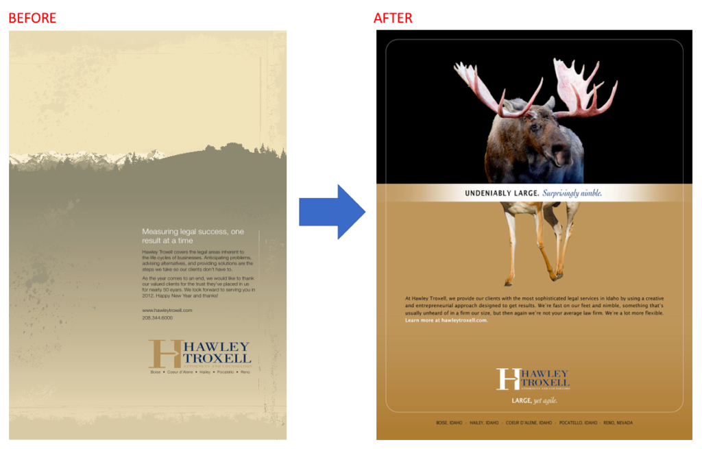
We wanted to ensure that our prospects knew that we were Boise’s biggest firm, with the best lawyers, top specialties, and most resources. But we also wanted to show that we were a dynamic, nimble, fast-moving firm — the best of both worlds. The safe, conservative ads the firm had been using weren’t designed to stand out, see the side-by-side comparison, below. The update immediately makes the firm appear more fun and innovative.
Consider, what do you feel about the culture of the firm on the left versus the one on the right? Doesn’t the “After” firm just feel more creative? More interesting?
So here’s how we expressed that message.
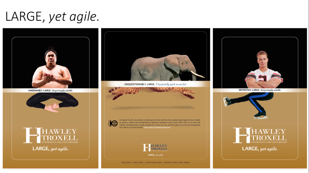
The new split-screen graphics were visually unique than the previous ads, conveying the entire story in the graphic and a short headline. It’s an effective visual for that reason.
The double pictures tell the story, and the headlines (e.g. “UNQUESTIONABLY LARGE. Unexpectedly quick on our feet.”) reinforce it. The font style matches the “LARGE, yet agile” tagline. Apparently there are a lot of moose and antelope in Idaho. Here are three versions:
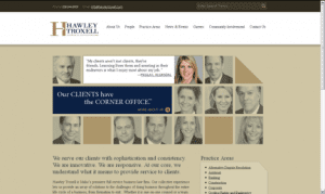
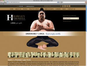
These new materials were a pretty big step forward. We developed a complementary home page design, blending their existing lawyer-photo imagery with the new brand:


(BTW, if you’re ever going to visit beautiful Boise, note that it’s pronounced “Boy-See” with a soft S, not “Boy-Zee.” Who knew?)
[This is a 2022 update to a previous post.]
—————————-
Need a new brand or logo for your own firm?
Contact Ross now at: ross [at] fishmanmarketing.com or +1.847.921.7677.
Download a free copy of his best-selling strategy and branding book, “We’re Smart. We’re Old. And We’re the Best at Everything.” here or buy an actual book on Amazon here.
Do your lawyers need marketing training or a dynamic speaker at a firm retreat, either live or via webinar? Ross is one of the legal profession’s most-popular marketing and CLE presenters. Here’s a link to a video of Ross in action.
Book Ross as a Speaker Now!
