Glenn Feldmann Darby & Goodlatte is a high-quality small firm – the Meritas network firm in Roanoke, VA, with some of the region’s leading lawyers. In a competitive regional market, the firm continued to excel, although its marketing remained traditional. After viewing Ross Fishman marketing and CLE Ethics presentations at a number of Meritas (“Law firms worldwide”) conferences, the firm engaged Fishman Marketing to overhaul the firm’s efforts.
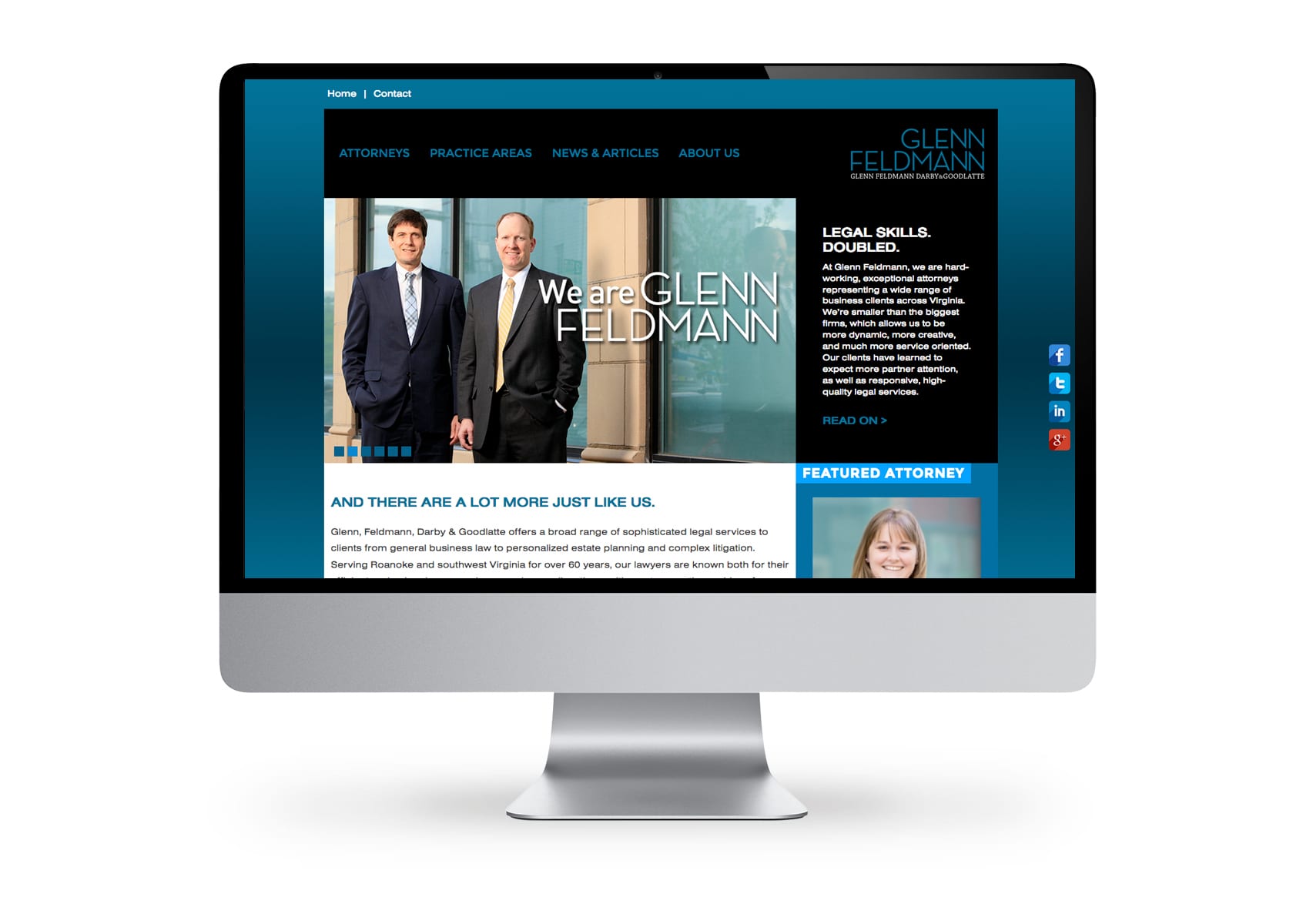
Redesign of logo
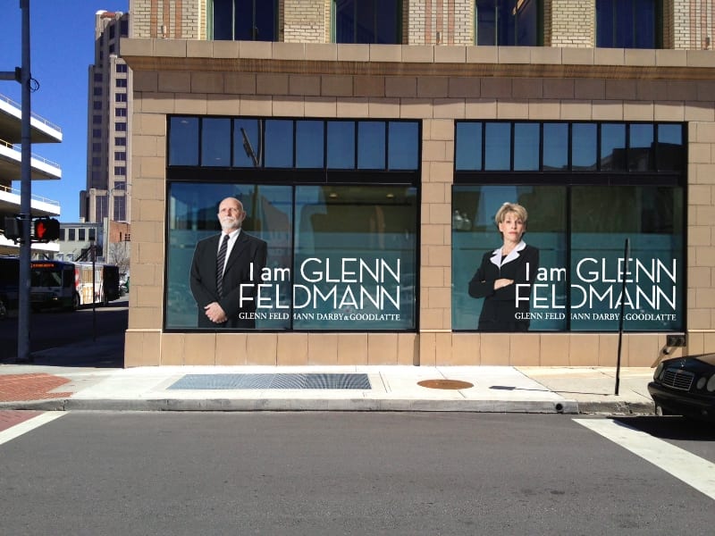
Series of images to emphasize the “I am Glenn Feldmann” campaign.
CASE STUDY
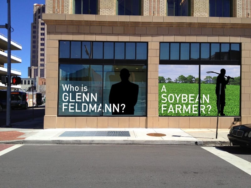
Two unusual things about the firm are its double-N firm name and that the firm’s name sounds as much like an individual as a firm. This gave us something we could leverage for marketing purposes, to help tell its creative story.
The firm had a strong, easy-to-spell and -remember name, but its logo had been focused on its initials rather than its name.
We redesigned the logo to reinforce the name and its memorable double Ns.


We launched the new marketing campaign with a series of print ads that leveraged the double-N spelling. Shortly thereafter, we launched the primary campaign, which focused on the firm’s name.
This provided the hook we needed to showcase the firm’s well-known individual lawyers. The firm’s office was on the ground floor of a building on a prime corner location on the main street through Roanoke, which offered the opportunity to leverage the prime real estate with teaser posters in the front windows.