“Good” Ads and Websites Don’t Work.
[2016 update]More creative is cheaper.
Stronger visuals cost less.
Here’s why:
See this ad? It’s one previously used by a client, Lorne MacLean, a small firm in Vancouver, BC. Nice guy, great lawyer, handsome photo (man in suit looking at paper), and a simple message that is clearly detailed in the text.
The style and structure makes perfect sense, right? It must, because it’s what most law firms tend to use. It’s a very common category of law firm marketing materials, both print ads and websites/blogs — uninspired photo and too much text.
Law firms hire a small local agency or web developer, or have their in-house team create something under specific instructions. It’s a lawyerly “Just the facts, Ma’am” approach, illustrated with a photo of one or more of their lawyers (or one of the 25 standard law firm cliches detailed here.).
What could possibly go wrong?
The problem is, it’s an enormous waste of money.
Although perfectly logical, it fails to accomplish a primary goals of any ad, website, or other visual marketing tool. It misses on all levels – the visual doesn’t grab the attention of anyone who isn’t actually pictured in the ad or directly related to them. (In this case, Lorne or his Mom, who loves him.) No one else would notice or care.
If the visual doesn’t grab your prospects they’ll never hang around long enough to read your text or absorb your message. “Good” ads don’t work. You must be great. Want some proof? What type of law does this firm practice? If you don’t know, the ad’s not working.
Frankly, your firm could run this ad 1,000 times and no one would ever notice it. It’s invisible.
You could read an article directly next to it and your brain would never even register what was directly adjacent. When you turn the page, it’s gone forever.
More than a waste of money, it’s a waste of opportunity.
Firms have very few chances to significantly improve their bottom line; don’t squander them.
Law firms run ads like these all the time, especially smaller firm and those in smaller communities where they don’t encounter as much great marketing that can drive more competition.
Want to see the difference? Look at the wedding-cake ad.
It’s the same firm and message as the one above — it’s just done better. It’s more visually impactful — more interesting and creative. It was actually designed to grab the readers’ attention and be remembered. And, of course, as a result, it does.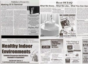
The very first time this ad runs, you’d notice it and remember it. And if I asked you a year from now, “Do you remember that divorce firm ad?” of course you would remember it.
A great ad doesn’t require multiple insertions before it gets noticed and starts to work.
A bland visual stays bad.
How many visuals do you recall from the last publication you read? Exactly. Very few, if any.
Standing apart is hard; it takes courage and commitment, and a sophisticated understanding of marketing.
Now compare them in context, below, mocked up together in a print publication. Which one are you looking at?
But after years of going the extra mile (or kilometer), taking a few more measured risks, and being more creative than the competition, Lorne MacLean’s original solo firm in Vancouver has grown to become the largest family law firm in all of British Columbia.
Does this stuff work? Yeah, it works.
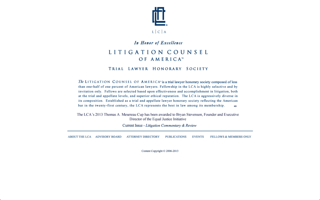
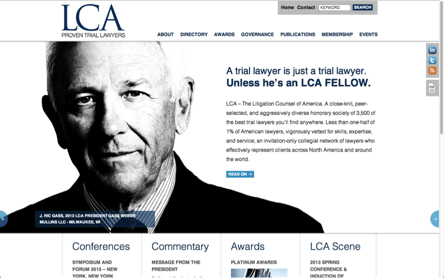
Now consider, which variety is your firm running, either in print, or on your website or blog? Below is a before-and-after example of a website as well.
It’s a website we designed for the Litigation Counsel of America (LCA), a 3500-member association of some of the nation’s top trial lawyers. The question is, which one reinforces the image of a leading organization:
BEFORE:
AFTER:
Does your marketing command this type of attention?
If not, give Fishman Marketing a call!
Contact Ross directly at 1.847.432.3546 or ross@fishmanmarketing.com.


