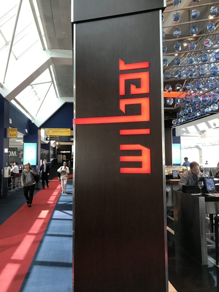
What does this sign say?
Some designers try too hard to be clever. They miss the point–they’re not creating art. Design is a tool to help a company sell something. Many designers get so caught up in being fancy artistes that their loyalty to their artistic sensibility actually does a disservice to the client. They need strong oversight by their marketing bosses. 
A good logo design should be clear, easy to read, visible from a distance, and help set the tone for the organization it is representing. I walked by a restaurant at LaGuardia airport a little while ago and couldn’t figure out what it said.
First, it was written vertically, which means you must tilt your head one way or the other to read it, which interferes with simple, clear communication.
Second, here, you had to tilt your head back and forth a few times, to see which way it goes. I’m still not sure.
Is it Wiber?
That’s an unusual name, I’ve never heard of a Wiber before. And is the second-to-the-last letter a stylized e or an a? You can’t really tell.
Perhaps the other way? Maybe I’m reading it upside down?
No, that would say Jeqim, which is another odd spelling. So what’s the answer? I don’t know. And I didn’t care enough about them to ask. But if I wanted to eat there with a friend, I wouldn’t know what to tell him, or how to get there.
This logo is interesting and attractive. But I rate it a D+.
Clever idea, but very poor execution.
—————————-
Need a new brand or logo for your own firm?
Contact Ross now at: ross [at] fishmanmarketing.com or +1.847.921.7677.
Download a free copy of his best-selling strategy and branding book, “We’re Smart. We’re Old. And We’re the Best at Everything.” here or buy an actual book on Amazon here.
Do your lawyers need marketing training or a dynamic speaker at a firm retreat, either live or via webinar? Ross is one of the legal profession’s most-popular marketing and CLE presenters. Here’s a link to a video of Ross in action.


