Merging is tough.
Recently, there’s been a lot of talk regarding the merger discussions between 1,000-lawyer Orrick and 700-lawyer Pillsbury Winthrop, which would create a Top Ten US law firm (See, e.g. Above the Law). It’s not a sure thing, of course, most merger discussions lead nowhere. Why?
Forget strategy, compensation, overhead, billing rates, and integration, the marketing alone can be a huge challenge. And massive corporate compromise rarely achieves the best marketing solution.
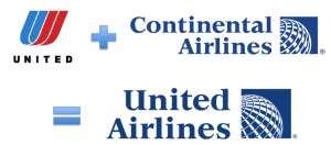
When United and Continental merged, the combined logo looked like an accommodation made by a committee. You can hear the squabbling marketers sitting around a table, each advocating for their own solution. Eventually:
“OK, fine. We’ll use your name, but you must use our colors, font, and mark!”
“Done!”
So, if Orrick merges with Pillsbury Winthrop, what would the logo look like?
How about. . . ?
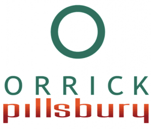
Just kidding, the most-likely short-term scenario based upon size and readability is something closer to “Orrick Pillsbury.”
This would retain Orrick’s beautiful “O” logo, and some of the letters can be kerned to match up nicely (the Ls and the R, the K and Y, etc.), although you’d have to squish “pillsbury” a bit to balance the shape. And obviously, they’d have to pick a color – the orange and green must never be used together. Perhaps Orrick will go with Pillsbury’s orange like United agreed to Continental’s blue?
(I discussed and handicapped the possible naming options back when Winston & Strawn was in merger talks with Howrey & Simon here. Winston & Howrey? HowreyWinston? How Win?)
Looking for help naming, re-naming, or branding your own firm?
Contact Ross at ross@fishmanmarketing.com. He’s successfully branded more top firms than just about anyone in the industry, worldwide. See Fishman Marketing for dozens of examples, including this post to the 30 Best Law Firm Tag Lines.


